AIM Fight & Why Web APIs are Cool 18 years, 9 months ago by Martey Dodoo

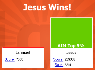
AIM Fight [via Waxy Links] is pretty cool, despite its Flash-based interface. I was a bit paranoid about entering my screenname at first (spim happens!), but was reassured after I read the "What is AIM Fight?" page ("Who made AIM Fight? Two AIM programmers with a little bit too much free time on their hands.") and did a WHOIS (which showed that aimfight.com was registered by America Online).
The website's AOL connections allow it to connect the AIM network and almost instantly find all of your online buddies, all of their online buddies, and so on. I reminded of BuddyZoo (a web application created by Adam D'Angelo, a student at Caltech, that graphed your AIM buddy lists), which was popular at Harvard about two years ago. The problem with BuddyZoo was that it did not automatically update itself. If you uploaded your buddy list to BuddyZoo, and then make three new friends, you were forced to update your buddy list. If D'Angelo was lucky enough to work for AOL, BuddyZoo's SVG graphing might have remained popular.
But why should you, gentle reader, be concerned about a fad that died two years ago? Because of the advantages you might have gained had it not died.
Take Google Maps. Yes, the interface is clean, it is fast to use (comparably), and it's really cool to see satellite pictures of your house. So what? APIs, that's what! APIs allow programmers to extend Google Maps. Many of these additions are chronicled on the Google Maps Mania blog. There are no APIs for interacting with the AIM network, and there is no AIM Mania blog (this page does not count).
If you are not convinced, here is a real-life example. When I wrote about Tim Klimowicz' Flash-based map of Coalition deaths in Iraq, I had suggestions (which I would like to note for the record, he responded to) about how he could help alleviate his concerns about representing deaths of living, breathing human beings with small black dots:
Zooming would also make it possible add more context to the presentation by "personalizing" each death. If I could hover over the black dots and see more information about whose death was represented, it would help alleviate some of Klimowicz' concerns about representing deaths with "little more than a tiny black dot on a computer monitor."
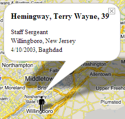
Google Maps, as those of you who checked out Google Moon saw, allows zooming. The "Iraq War Casualties Map" displays American war dead organized by hometown. While the individuals are represented by stick figures, clicking on each figure displays a pop-up window with details, as you can see from the image on the right.